Posters

When one of your favorite power pop bands asks you to make a poster for their reunion show you say yes.

I can't help it. I love portmanteaus. My brain comes up with them before I realize I'm doing it. This one didn't even make it to the Department of Health for review but come on. I mean, it's just right there!

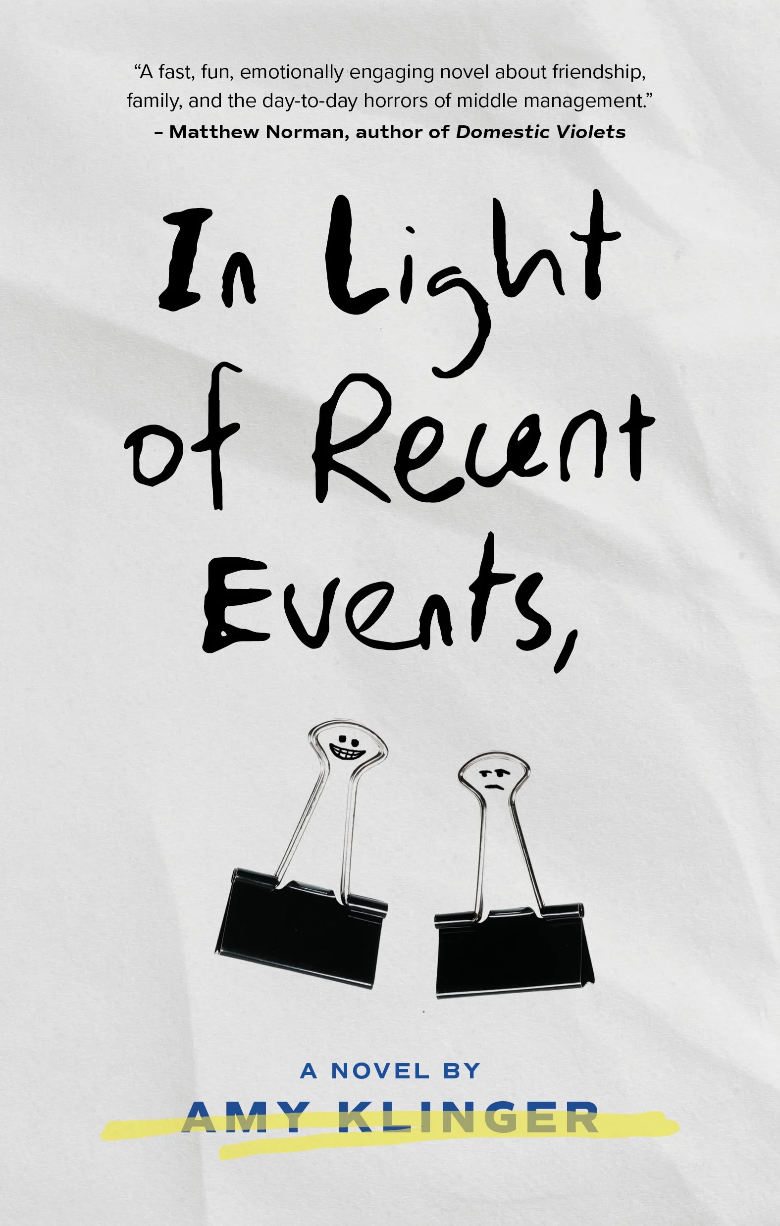
Amy Klinger asked me to design the cover for her debut novel, based around a couple of screw-ups in 90s office culture. Anyone who's spent time at an office day job knows the materials around you take on all sorts of life.

This is one of a series - three different messages, three different color variations - working toward ending opioid abuse. Simple is good.

HMC needed a little pick me up and I figured a mural to replace a crusty chipped old wall might be a good little kickstart. "Beat Yesterday" was a phrase we were tossing around for a minute so I ran with that and knocked the whole thing out in a weekend. Hard to see but that gold is gold. ✨

Piebald!? Heck yes. Farewell show? Heck no. Fun poster, though!

A personal project. Hand carved and set in old lead type. Letterpress printed in a run of 37. Get at me if you want one.

Poster idea for a library speaker series. This was not used! Still think it's fun to see how far you can push legibility in weirdo lettering.

Do you remember the old GigPosters forum? I miss that little corner of the internet and the endless amounts of inspiration it had to offer.

Full disclosure: this is my old band. Not Session Americana, the other one. But getting to play with Session Americana, at the Brattle Theater no less, was a darn good reason to pull out the stops and get these suckers screenprinted.

Oldie but goodie example of play at work in…well, the work.

Ok yes he's my nephew but we also share a birthday. Are there things about this I'd change? Yeah, for sure. Am I going to delete it? Look at that cute little Buddha and take a wild guess, pal.

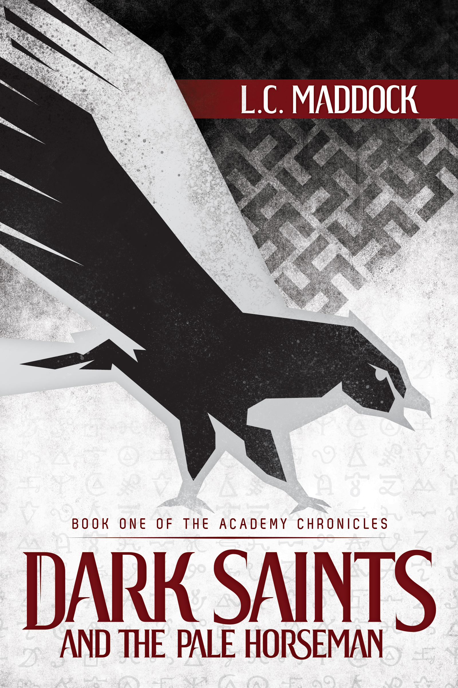
Book cover for the first in a trilogy of historical fiction books. Unfortunately books two and three never happened or this would've been a fun box set to put together.

The thing that's fun about gig posters is that they are kind of informed by conveying really important info but they're also really dependent on…vibes. Let the music lead!

Look, I'm biased ok? If you've made it this deep into my website you deserve to know that my niece was a super cute little nugget.
